A counter-drone system that finally looks the part
Operators loved how the system worked. It just looked older than the tech inside it. We kept the workflow and redid everything they see.
- 1 → 8one concept screen grown into an 8-module system
- 16pxbody text, up from 11 to 12px, tested with ~20 users
- ~90%design-to-code fidelity, against an 80% target
Why it mattered
Sentrycs finds unauthorized drones and takes control of them, at airports, military bases, prisons and ports. Operators were happy with how it worked. The problem was how it looked: old and generic, for a young company showing off serious tech at conferences. And on field tablets the main text was 11 to 12px, in a system where missing an alert really matters.
The solution
Everything operators already knew stayed where it was. Everything they look at got redone, from the live map to analytics, and it all lives in a style guide the dev team actually used.
Live map: the screen operators watch all shift.
 BeforeAfter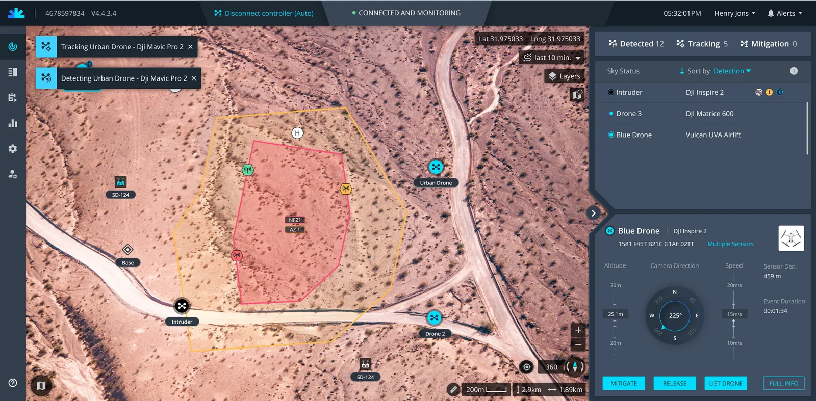
Same workflow
Same layout, navigation, logic and microcopy. Nobody had to relearn a live defense tool.
Text you can read
16px body text with a 14px minimum on a clean rem scale, checked on both tablet and desktop.
A map language
I redrew drone states, markers and zones to match what's common in the market, then tested them on real terrain.
Glass that ships
The glass effect looked great in Figma and was tricky in code. I worked it out with the developers and ran design QA until we hit ~90%.
What we learned
This one taught me you can give a product a whole new look without making anyone relearn it. Seeing the new design front and center in Sentrycs' own marketing videos still makes me smile.
The problem
Of the two problems, the small text worried me most. This is what operators were reading on field tablets, next to where we ended up.
Before
Drone 3 · DJI Matrice 600
Alt 25.1 m · Speed 15 m/s · Sensor dist. 459 m
11 to 12px core text
After
Drone 3 · DJI Matrice 600
Alt 25.1 m · Speed 15 m/s · Sensor dist. 459 m
16px body, 14px floor
The evidence
The lead designer made the first concept screen. My part was figuring out how that one screen turns into a whole product, and later, as the only designer, getting it shipped.
Keep: the UX operators already trust
- Layout & navigation
- Operating principles
- Microcopy
Upgrade: everything they see
- Colors & contrast
- A more advanced, modern design
- Highlighting what makes the product unique
- SimplicityPractical · systemic · operational
- EnergyLight · gradient · layered depth
- ModernNeon accents · glass · dark
One screen, broken into parts
Every module uses the same building blocks. Hover or tap one to see where it sits.
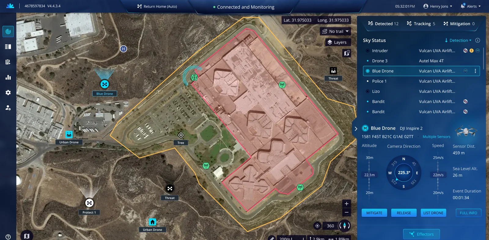
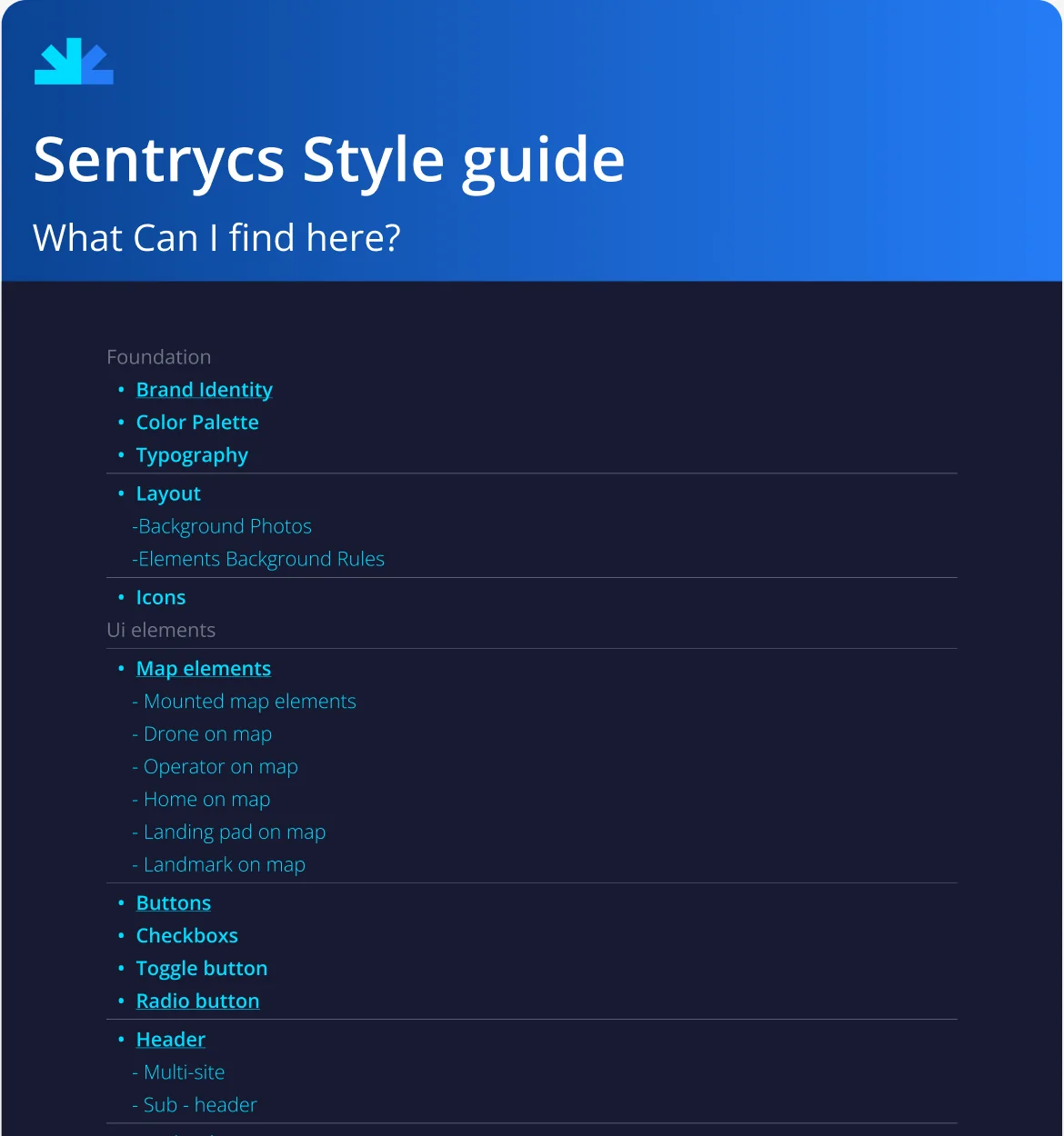
A style guide made for this product
Generic UI kits don’t come with drone states, no-fly zones or satellite maps, so the style guide had to cover them.

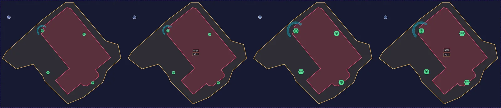
 Desert
 Snow
Snow Port
Port Hills
Hills
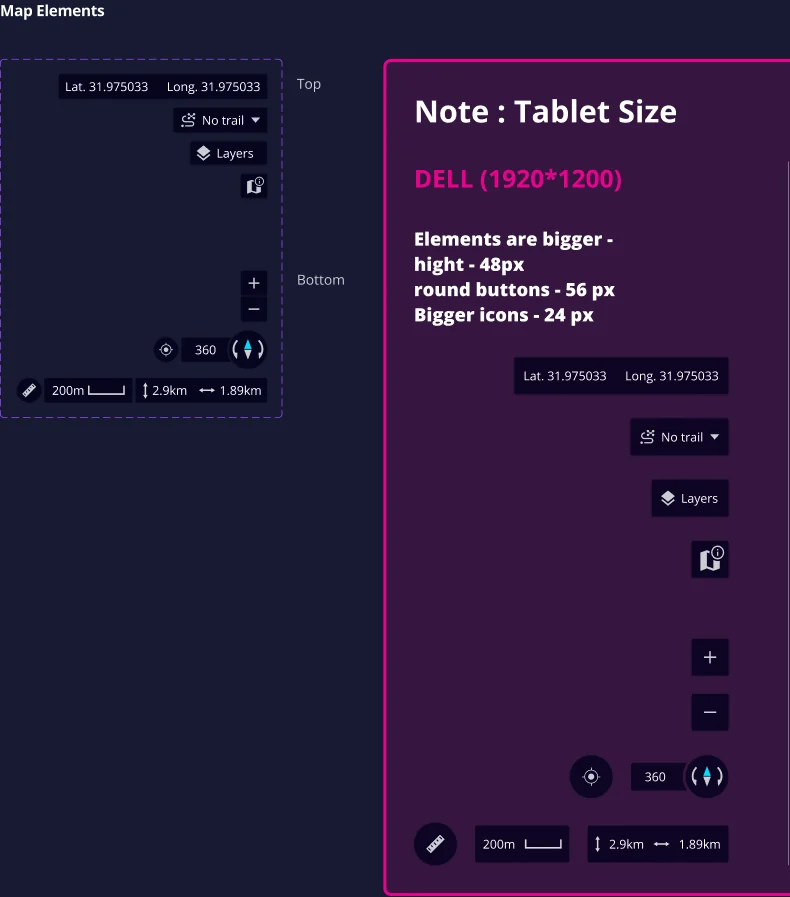
The result
Usability tests showed the workflow still felt familiar, operators and stakeholders were really positive, and it shipped. Here’s the operator’s main loop on the final screens.
The new flow · tap a step to see it
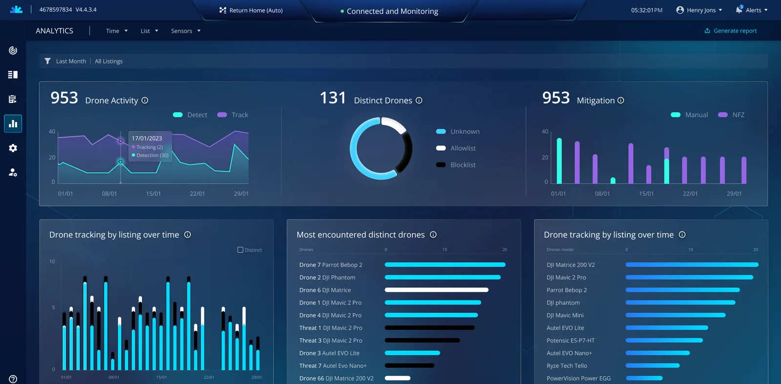
And you can see it in Sentrycs’ own marketing videos:

