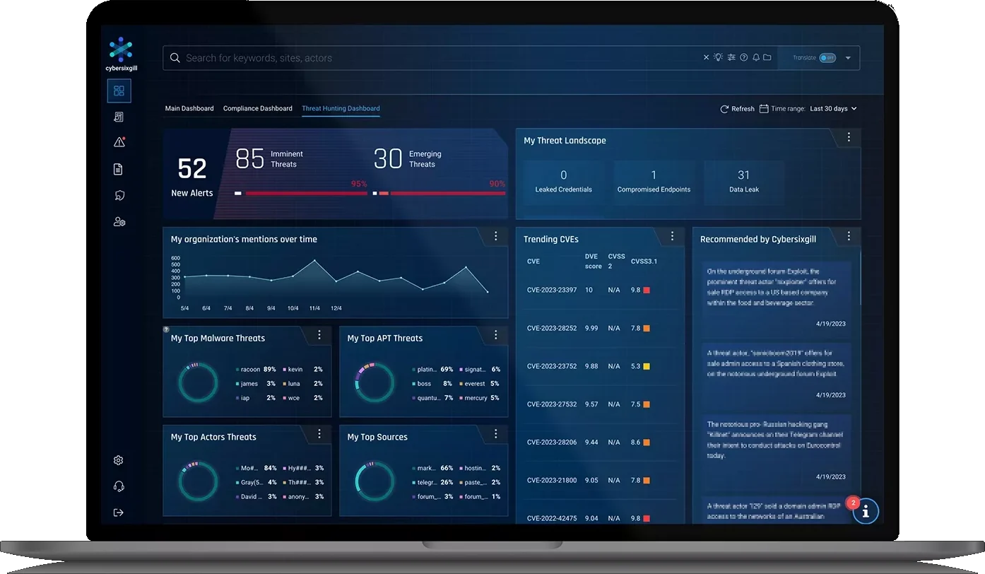
Designing for 10 alerts and 10,000
A dark-web threat intel dashboard that had to feel calm with ten alerts and still hold up with ten thousand.
- 10 → 10Kevery widget designed to hold numbers from ten to ten thousand
- 1 gridfor every dashboard widget, so new ones just drop in
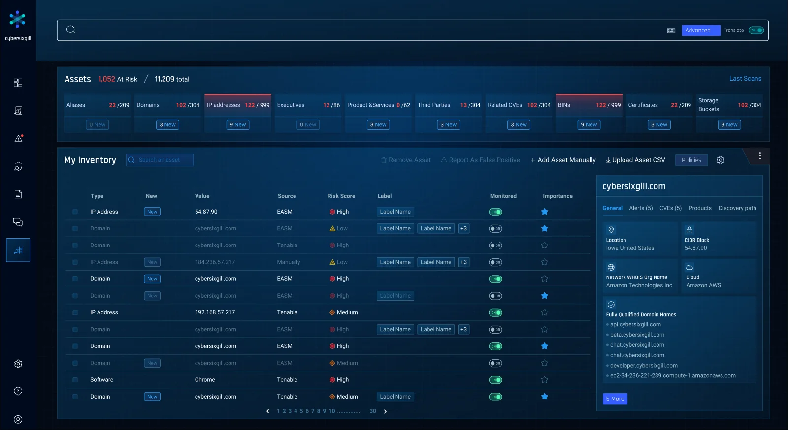
- 11K+assets the inventory was designed to handle, sorted by risk
Why it mattered
Cybersixgill pulled threat intel from the deep and dark web: forums, markets, paste sites, chat apps. Analysts opened it to answer one question, what's threatening my company right now? The same screens had to work for a five-person security team and for an enterprise with thousands of alerts and over eleven thousand assets.
The solution
One strict grid for every widget, each widget drawn at three data volumes, and an asset inventory where teams decide once what to watch.
What threatens my organization today, in one screen of widgets.
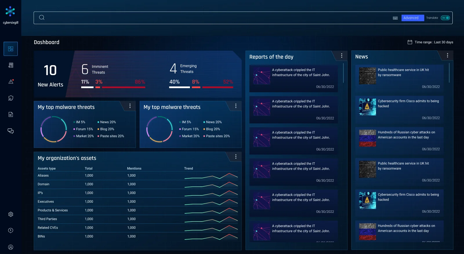
One widget grid
3 columns by 3 rows make a small widget, with 16px between them, lined up with the search bar.
Built for volume
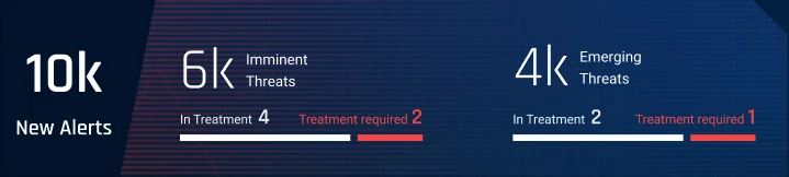
I drew each widget with regular, 100+ and 1k+ data, so a big number never breaks the layout.
Riskiest first
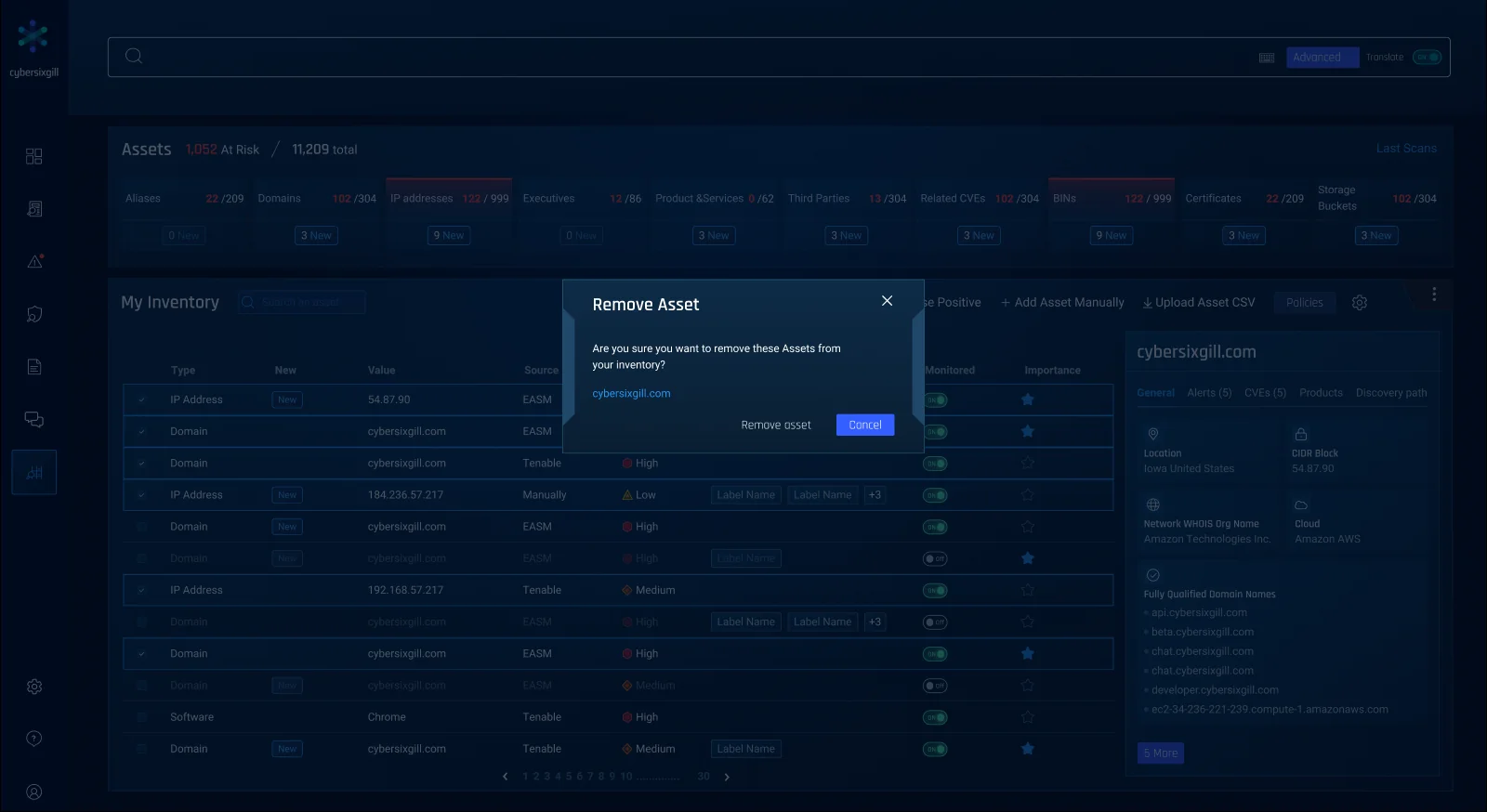
Domains, IPs, executives and more in one table, with new and risky items on top.
Set it once
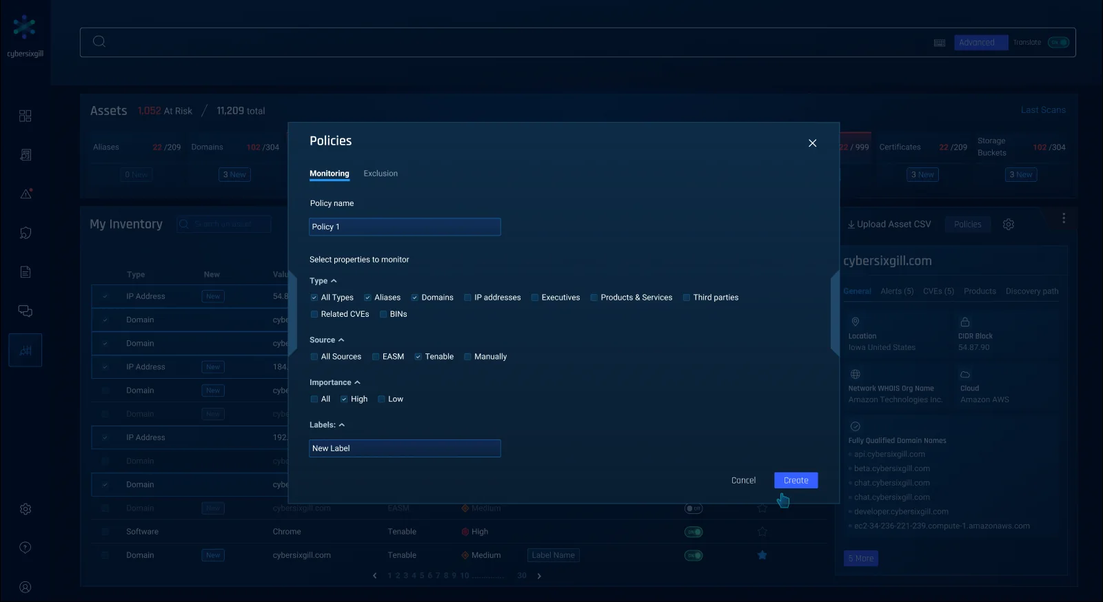
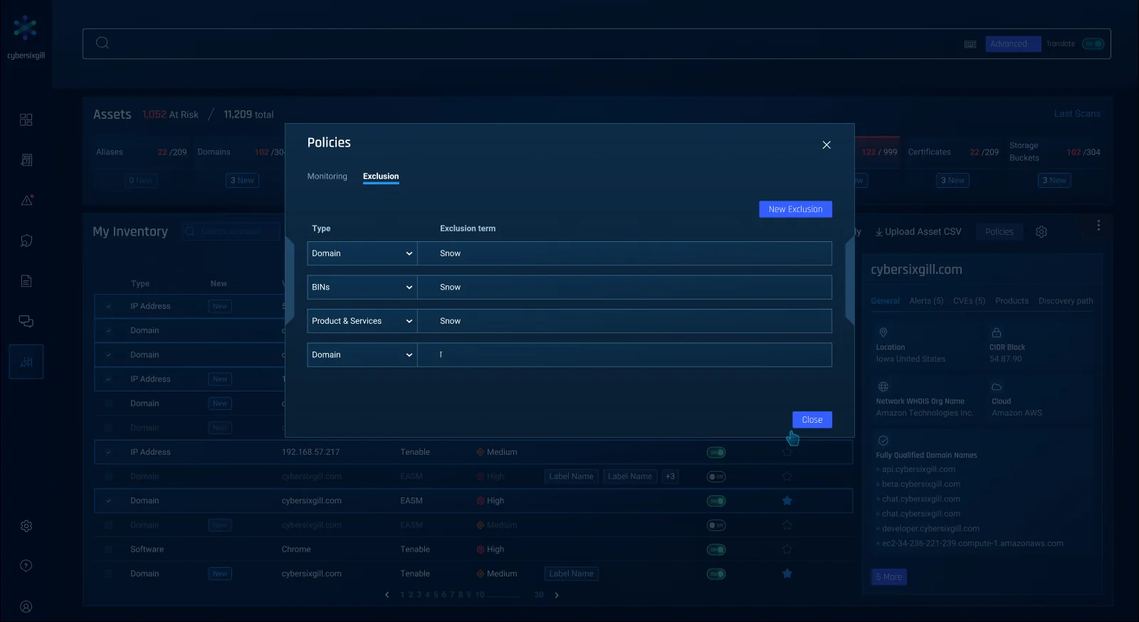
Teams choose what to watch and what to skip, instead of cleaning the list by hand every week.
What we learned
Security dashboards get judged on their worst day, when the numbers spike. So I started designing every widget for the biggest customer first, then checked it still felt calm for the smallest one. That habit stuck with me.
The problem
A threat feed only helps if it fits on the screen. A widget could show 10 for one customer and 10,000 for the next, and the layout had to handle both.

The evidence
One grid for every widget
Instead of designing each dashboard from scratch, we set one rule every widget follows. That way a new widget just drops into the grid.
- 3 × 3columns × rows make one small widget; bigger widgets are multiples
- 16pxbetween every widget, everywhere
- 130 / 50left and right margins, so widgets line up with the search bar
An inventory that cleans itself
Attack surface monitoring added thousands of assets per customer. We designed the flow so the list stays useful without anyone pruning it by hand.
The result
This is the inventory flow we ended up with, on the final screens.
The new flow · tap a step to see it
The look carried into the product Cybersixgill shipped, and it’s what they showed on their own site: