From paper binders to 15,000 farms
Farmers had the app and still used paper. We made it simple enough to use between cows.
- ~15Kfarms using the app daily, up from almost none
- 50+countries, tested on farms in New Zealand and Italy
- ~10×task events logged, 0.03M (2022) → 0.29M (2024)
Why it mattered
Afimilk's sensors track every cow on the farm, but the data only helps if farmers log what they do: inseminations, treatments, new tags. The field app was made for exactly that, and almost nobody used it. Farmers kept paper binders in the barn and typed things in later, if at all.
The solution
I cut the app down to the day's work. Home is today's tasks, each task is one short flow, and the wand farmers already carry is the fastest way in.
Counters, cards and lists all fighting for attention. Now each task gets one card with today's progress.
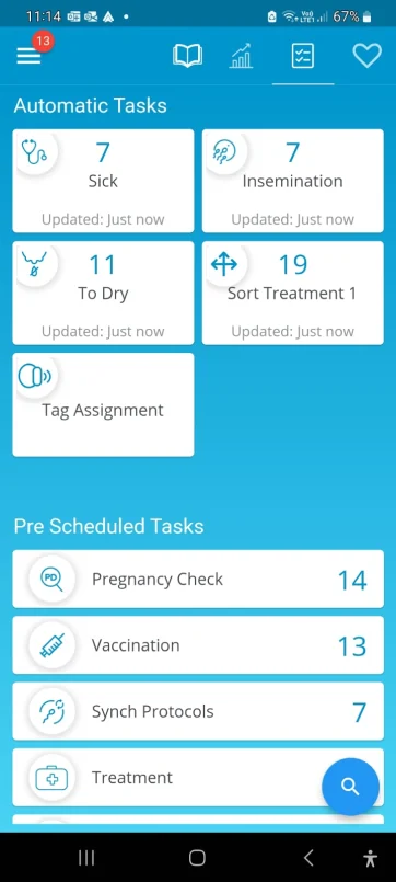
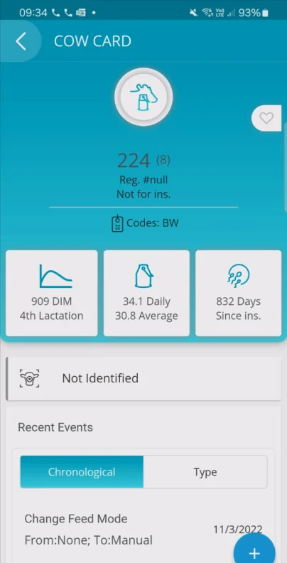
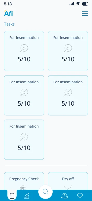
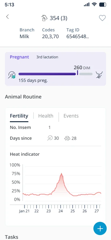
Today's work first
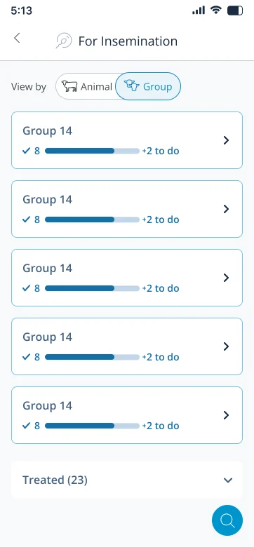
Home is the list of today's tasks with progress for each group. The dashboard of counters is gone.
One flow per task
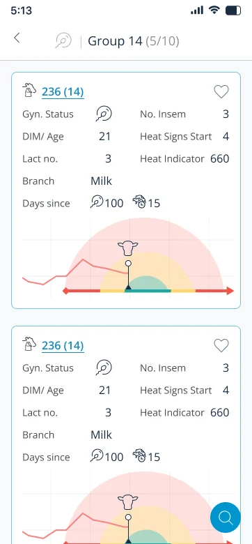
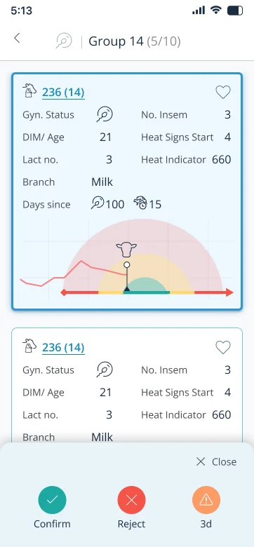
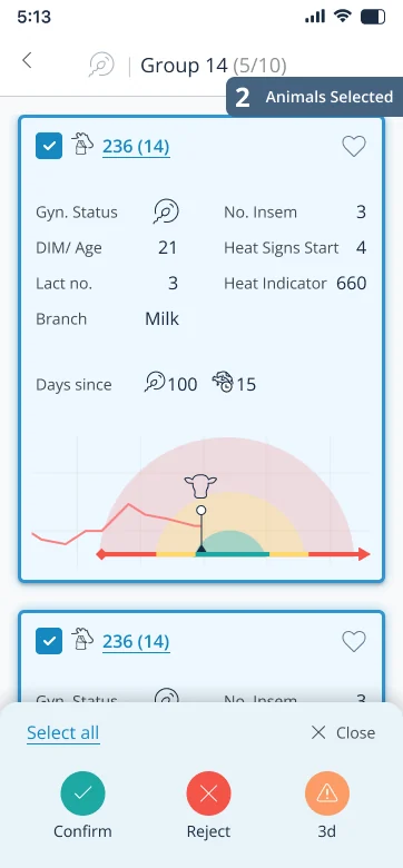
Find the cow, do the task, move on to the next. It's the same flow from a task or from the cow card.
Built for the wand
Type an ID or tap a tag with the wand. Bulk jobs like tagging stay open for the next cow.
Nothing that only looks tappable
If it looks like a button, it is one. Cards that only looked tappable and tooltips that wouldn't close are gone.
What we learned
Going in, I was sure we'd need tutorials. Then I watched farmers use the app and it clicked. They were fine with tech. What wore them down was every extra tap. My favorite part of this project ended up being deleting things.
The problem
The app could do a lot. Farmers opened it, found a cow, and left without logging anything. The one task that makes the whole system work was the one nobody finished.
Before: the one flow that mattered, and where people dropped off
- Open the appLands on a dashboard of counters
- Find the cowSearch, or scroll a list
Most left here
- Cow cardGraphs and tiles first
- Log the taskRarely reached
After
- Open the appLands on today's tasks
- Pick a taskProgress per group
- Pick the cowOr tap her tag with the wand
- Log it, next cowOne tap, list stays open
Most farms never logged anything
Logged in bursts
Big batches entered seconds apart. Farmers wrote things down in the barn and typed them in later.
Tags assigned in bulk
574 farms kept assigning tags long after setup, many at a time.
Two ways in, used equally
So both doors had to lead to the same short flow.
The evidence
The numbers showed us what was happening but not why, so we went to the farms. We visited, ran about 15 contextual interviews, and joined remote sessions where farmers shared their screen and used the app while we watched.
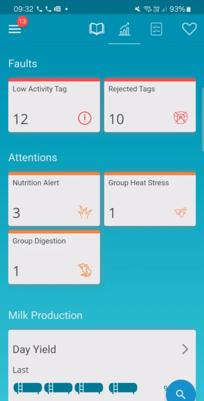
Looks tappable, isn'tEvery card has a shadow and an icon. None of them open anything.
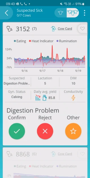
Hints at a scroll that isn't thereThe next cow peeks in from below, so people tried to scroll a list that didn't move.
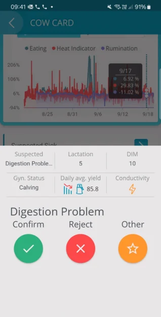
A tooltip that won't let goTap the graph once and the tooltip stays on top until you take an action.
Too much thinking between cows
These farmers run complex herds and equipment every day, so skill wasn’t the issue. The app kept making them think. Which card opens? Where does the list end? How do I close this tooltip? In UX terms the cognitive load was way too high for a job you do standing next to a cow. Paper never asked them anything.
One flow, built around the barn
Tag assignment is a good example. The data showed farms tag lots of cows in a row, long after setup, so I built the flow for a line of cows and a wand in hand.
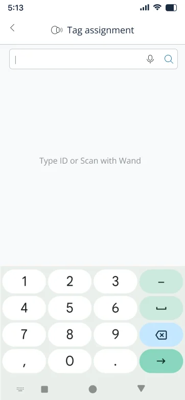
Type or scanOne field. Type the cow's ID or tap her tag with the wand.
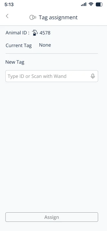
Confirm the cowHer ID and current tag, then the new tag. One button.
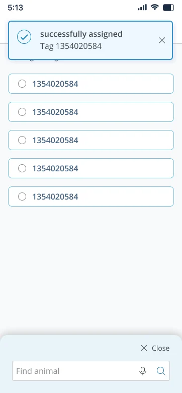
Next cowA short confirmation, and the drawer stays open for the next one.
We also looked at swipe and multi-select patterns from other apps. Long swipes didn’t fit how our users work, so we dropped them early.
The result
The redesign shipped and held up in field tests in New Zealand and Italy, with only minor bugs. And logging finally moved from paper into the app:
Here’s the flow farmers use now, on the final screens.
The new flow · tap a step to see it