When everyone says "it doesn't look good"
Clients and management both said the herd system didn't look good. Under the surface, new users couldn't find their way around.
- 15K+dairy farms in 50+ countries on the redesigned system
- Betatesting with real users showed onboarding got easier
- 4core areas rebuilt on one shared set of components
Why it mattered
Afimilk's herd system runs 15,000+ dairy farms in 50+ countries and tracks over 10 million cows. Milk yield, fat and protein, conductivity, all the signals that catch things like mastitis early. The people using it are farm managers and farmers, 30 to 70 years old, who spend most of the day outside and come into the office to log data and check on the herd. If they can't find what they need, all that data just sits there.
The solution
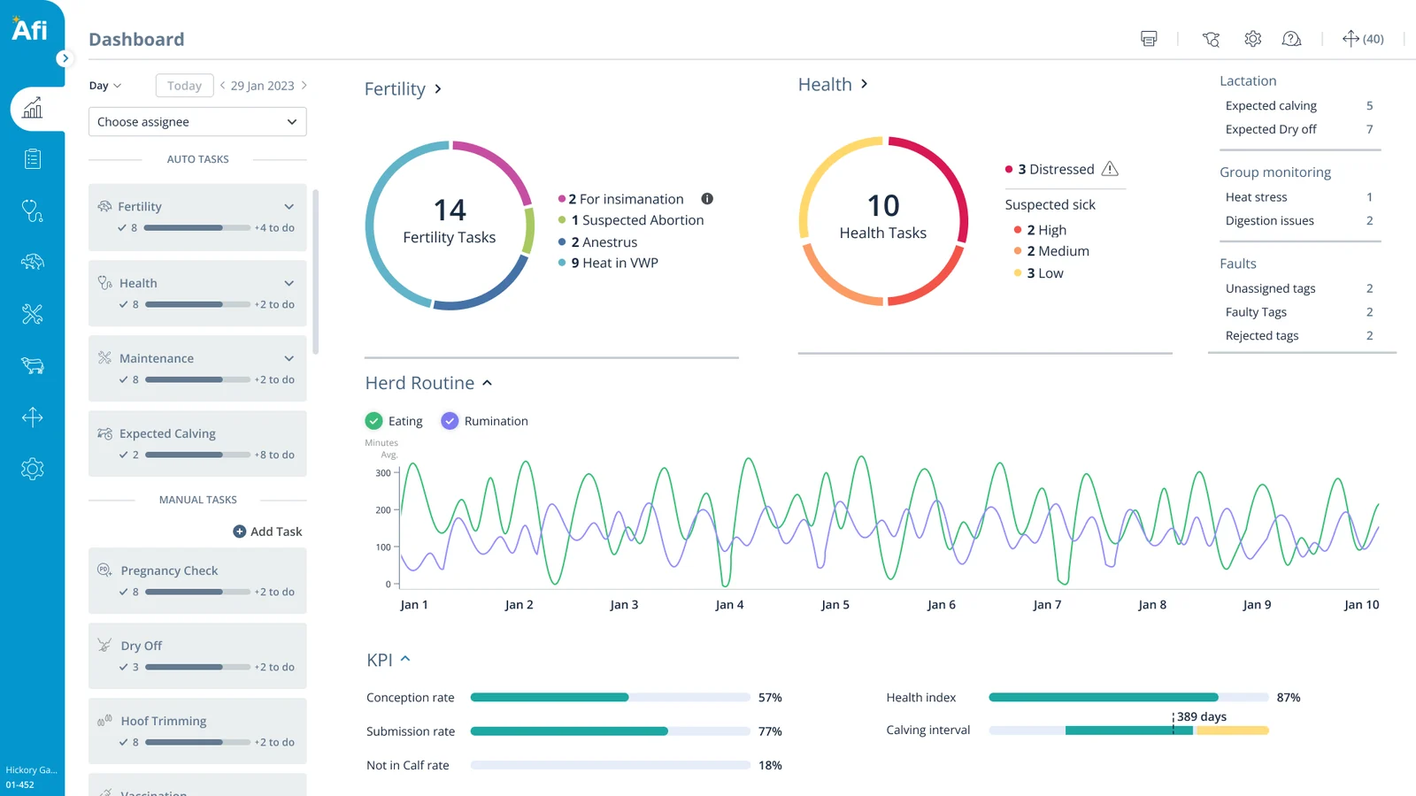
We focused every screen on the job farmers came to do. Less decoration, more data, and the features that only made sense in the office got cleaned out.
Same page, same data, a lot less noise.
 BeforeAfter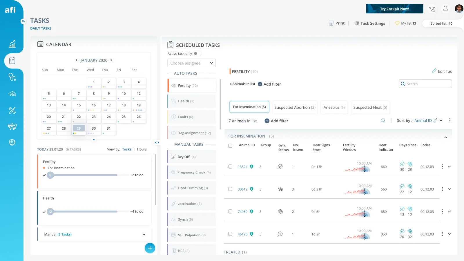
Data first
Decoration out, numbers in. The tables hold more columns now and still feel calmer.
Progress at a glance
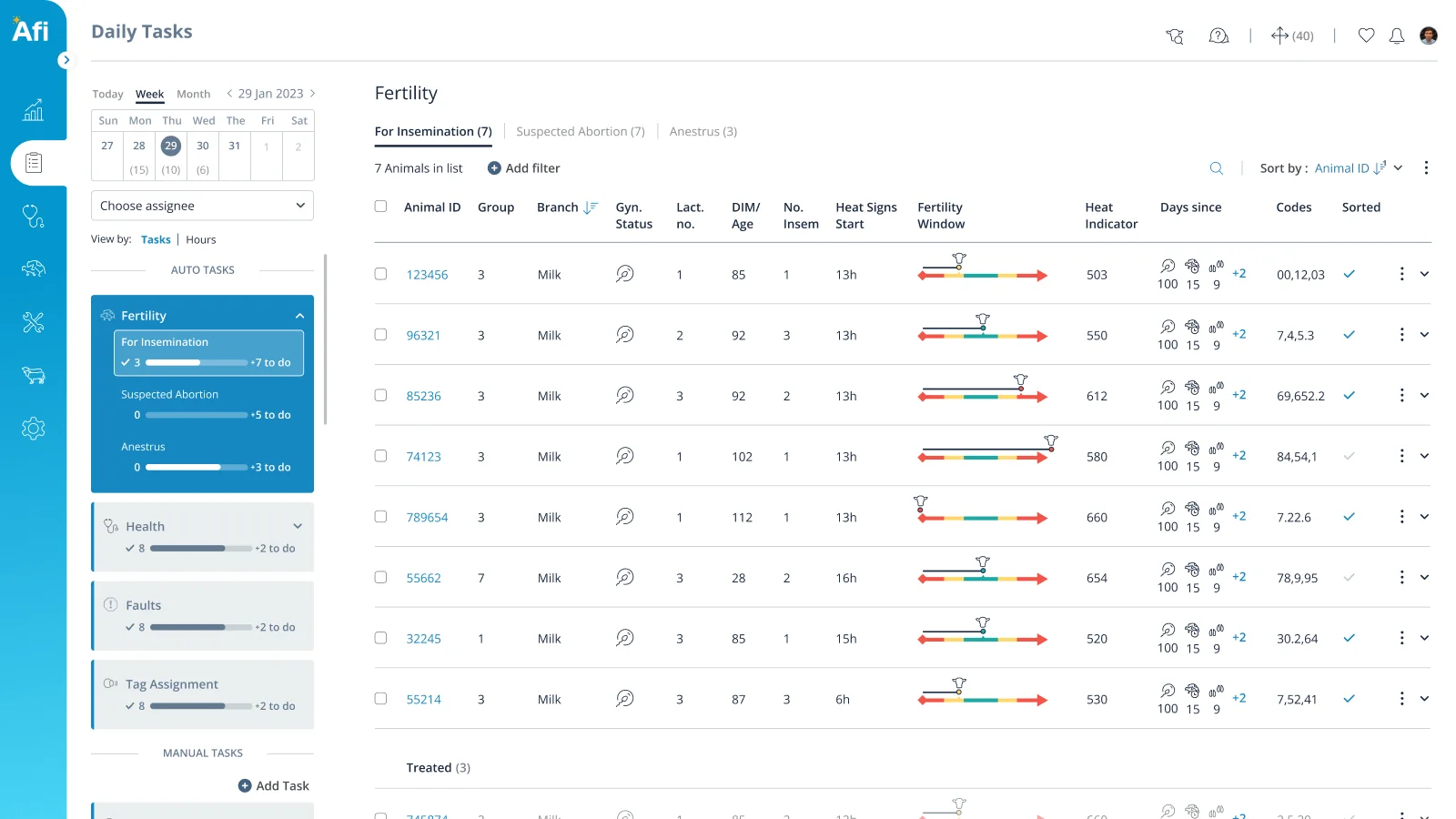
Tasks are grouped by type, and each one shows what's done today and what's left.
Based on real use
Feedback showed us what farmers don't use, so office-only features came out.
One look everywhere
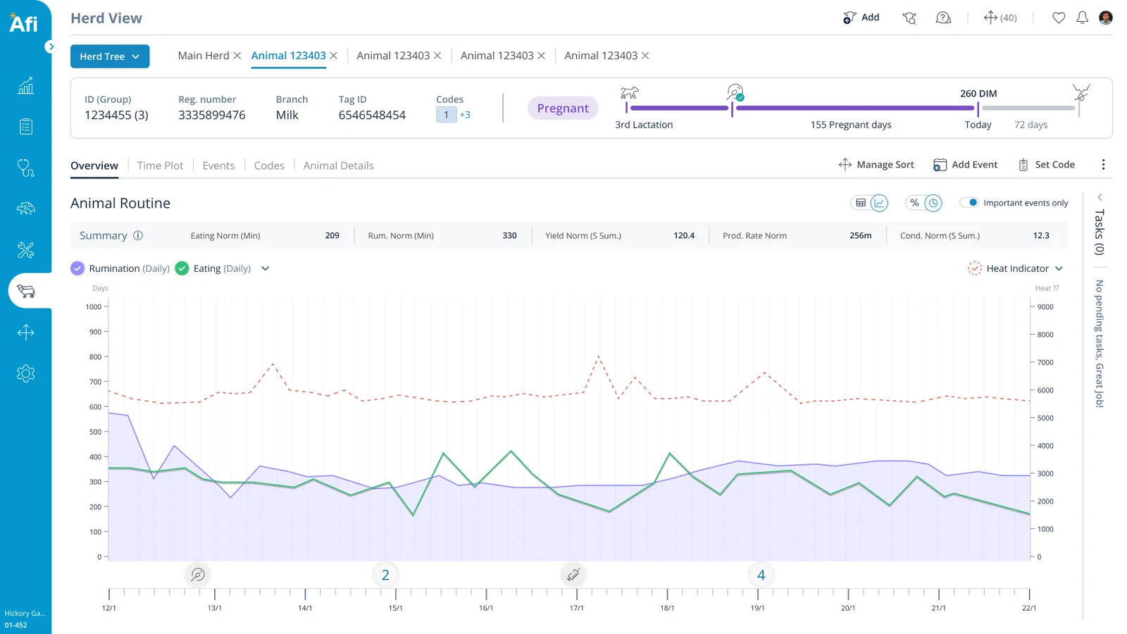
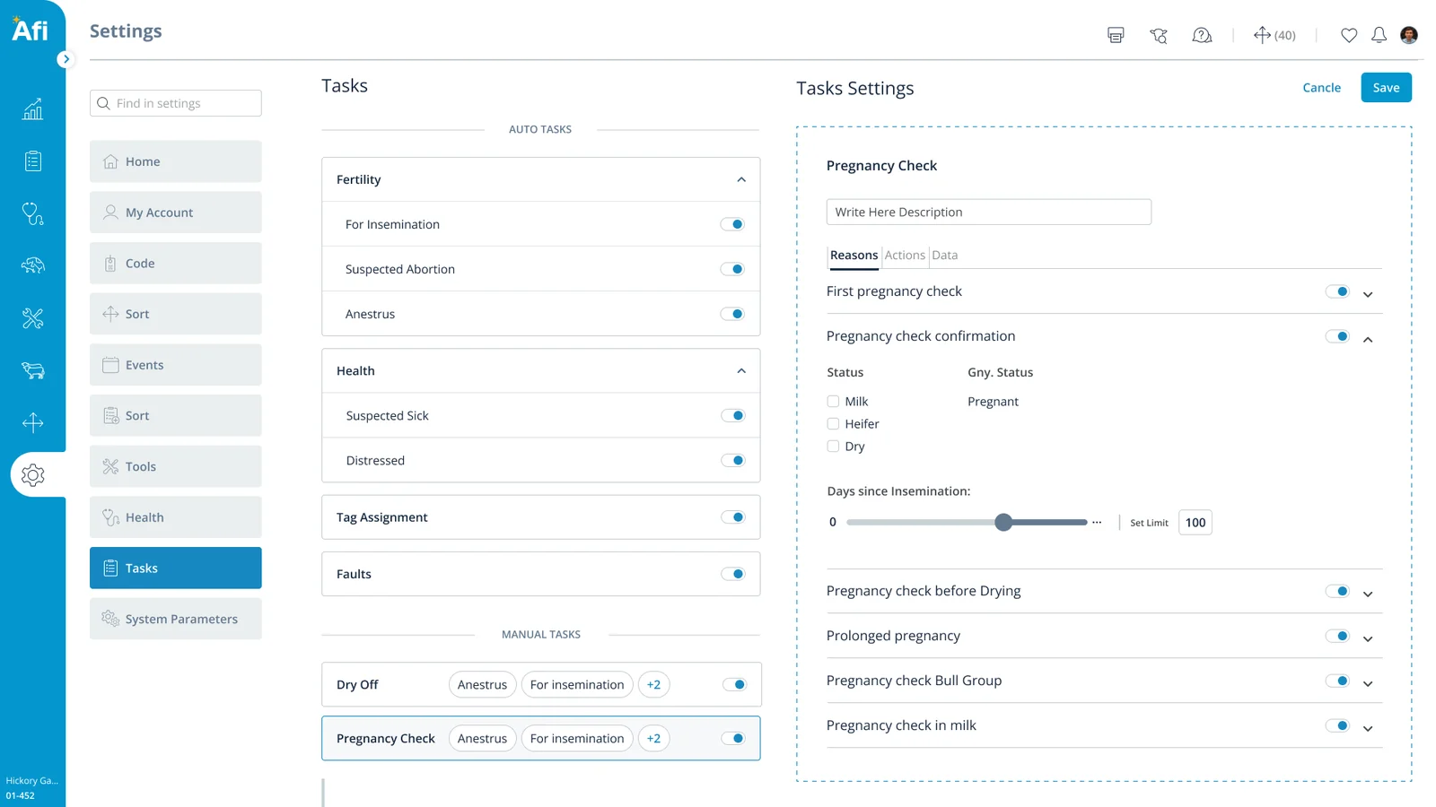
Dashboard, herd view, tasks and settings all share the same components and colors.
What we learned
My biggest takeaway was to ask people what they don't use. Afimilk is really close to its farmers, and that showed us which features only made sense in the office. Cutting them helped new users more than anything we added. Next time I'd ask sharper questions too. There was one small data point I simplified instead of digging into, and I still wonder what was behind it.
The problem
The system had tried to be trendy and elegant, and got buried under graphic add-ons that didn’t age well. New users struggled to find key features, and the design system couldn’t handle the amount of data on screen.
How we got to a brief
- "It doesn't look good"Honest feedback from clients and management
- What's actually wrong?Outdated, cluttered, too many add-ons
- What does look good?The team named Monday, Jira, Adobe CC and Figma
- The briefMinimal, organized, elegant, and data first
The evidence
Two details, up close
Daily Tasks is the page farmers open every morning, so it shows the approach best. Keep the data, lose whatever makes it hard to read.
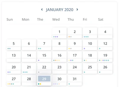
A full month grid with colored dots. Big, and still hard to read.
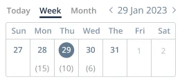
A week strip with the number of tasks per day. Today is one tap away.
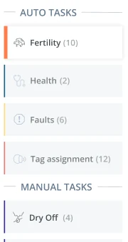
A colored box per task with a count. No sense of how much is done.
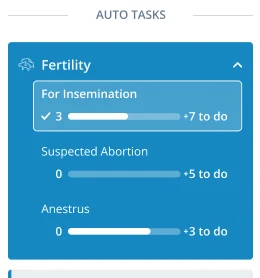
Tasks grouped by type, each showing how many are done and how many are left.
The result
Beta users told us in testing that onboarding got easier. We used that to make the case that the field workers’ app needed the same love, and I led that project next.
Here’s a farmer’s morning on the latest screens.
The new flow · tap a step to see it