Defense industry company
System concept.
This is a made up scenario, to keep the confidentiality for this system actual use.
The UX and UI are also adapted so the materials can be showed outside the company.
This is a made up scenario, to keep the confidentiality for this system actual use.
The UX and UI are also adapted so the materials can be showed outside the company.
The Client needs
Traveling agents that needs to connect with their desk computer when there are Un-secure connections , agents are working with multiple apps and needs to constantly check for their active connections while connecting up to 3 computers at once.
Traveling agents that needs to connect with their desk computer when there are Un-secure connections , agents are working with multiple apps and needs to constantly check for their active connections while connecting up to 3 computers at once.
The User - Dani , Age 43.
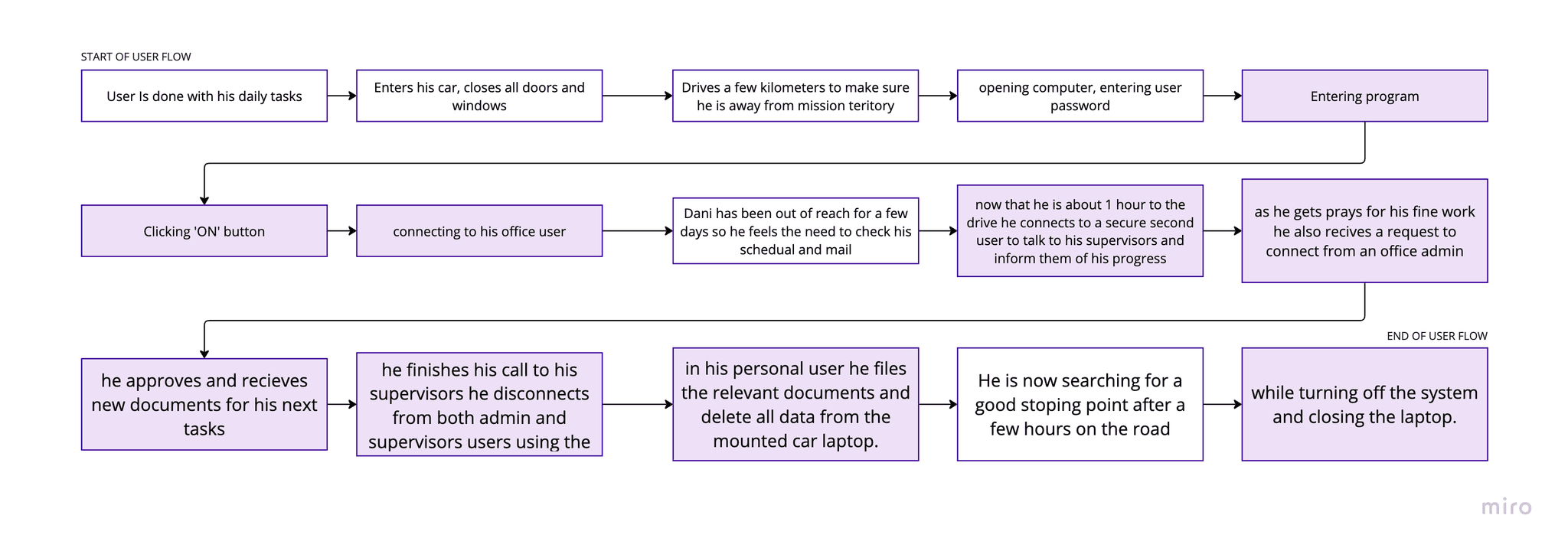
Dani is a field agent who spends a lot of time driving between missions, and this is his only time where he can safely talk and inform his managers of his work progress and answer calls, get new assignments and receive relevant data for his missions.
most of his drives happens at night and he needs to use this valuable time to close up loose ends.
most of the data he needs is in his desktop computer and most of the networks are not secure enough to log to his office network.
Similar to a VPN connection the users on both sides need to see the connection status


Process
References
For the shape and sizes of rhe program I took references from design programs like Illustrator where you have your work panel on the side for your tools, but also keep it on the right to reference to a more manual computer system like the WIFI panel built in it.
For the shape and sizes of rhe program I took references from design programs like Illustrator where you have your work panel on the side for your tools, but also keep it on the right to reference to a more manual computer system like the WIFI panel built in it.


Communication system - similar products the client wanted to consider are Microsoft Teams and Skype.
Communication system - similar products the client wanted to consider are Microsoft Teams and Skype.


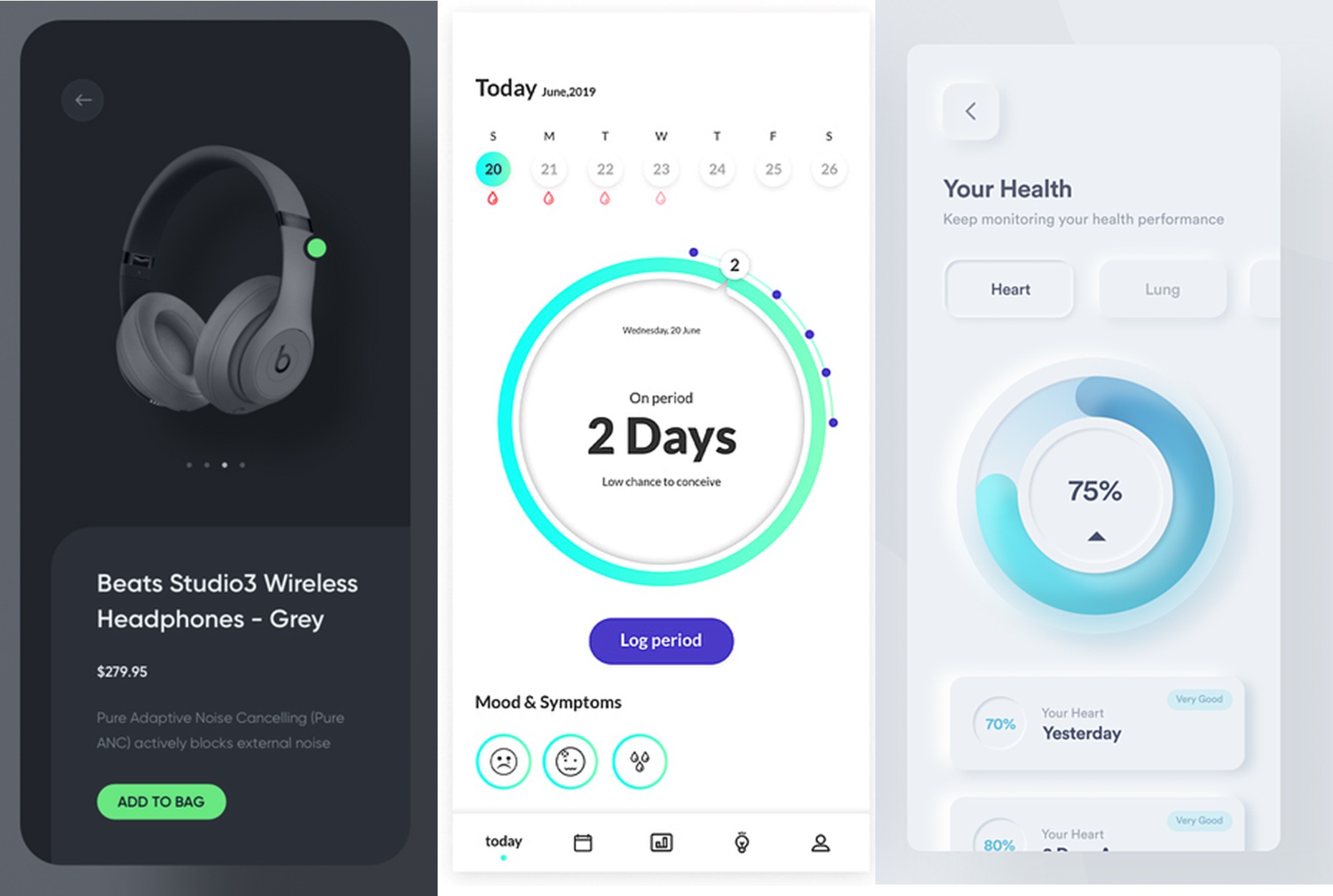
Design references - Combining a Trendy and elegant look.
neu-morphism inspired elements to make it like a car panel and reference it to its use.
on the dark panel, I also combined bright neon-looking colors to pop up the more important parts the user needs to notice.
Design references - Combining a Trendy and elegant look.
neu-morphism inspired elements to make it like a car panel and reference it to its use.
on the dark panel, I also combined bright neon-looking colors to pop up the more important parts the user needs to notice.


The Solution
Creating a system that works as a middle man between two computers or more, one is in the office and the other connected to an agent car.
this system connects to the hardware device and is used to track and talk to the drivers without needing to use their phones or insecure VPN connections.
Creating a system that works as a middle man between two computers or more, one is in the office and the other connected to an agent car.
this system connects to the hardware device and is used to track and talk to the drivers without needing to use their phones or insecure VPN connections.
More points That were in mind while working :
Resolution - Fitting a Laptop & tablet. both mounted to a car
High conrasts to match a multiple types of agents- ages 40-65.
Both tech savvy and non tech savvy
user can conduct several calls, recieve and read data at the same time.
More points That were in mind while working :
Resolution - Fitting a Laptop & tablet. both mounted to a car
High conrasts to match a multiple types of agents- ages 40-65.
Both tech savvy and non tech savvy
user can conduct several calls, recieve and read data at the same time.
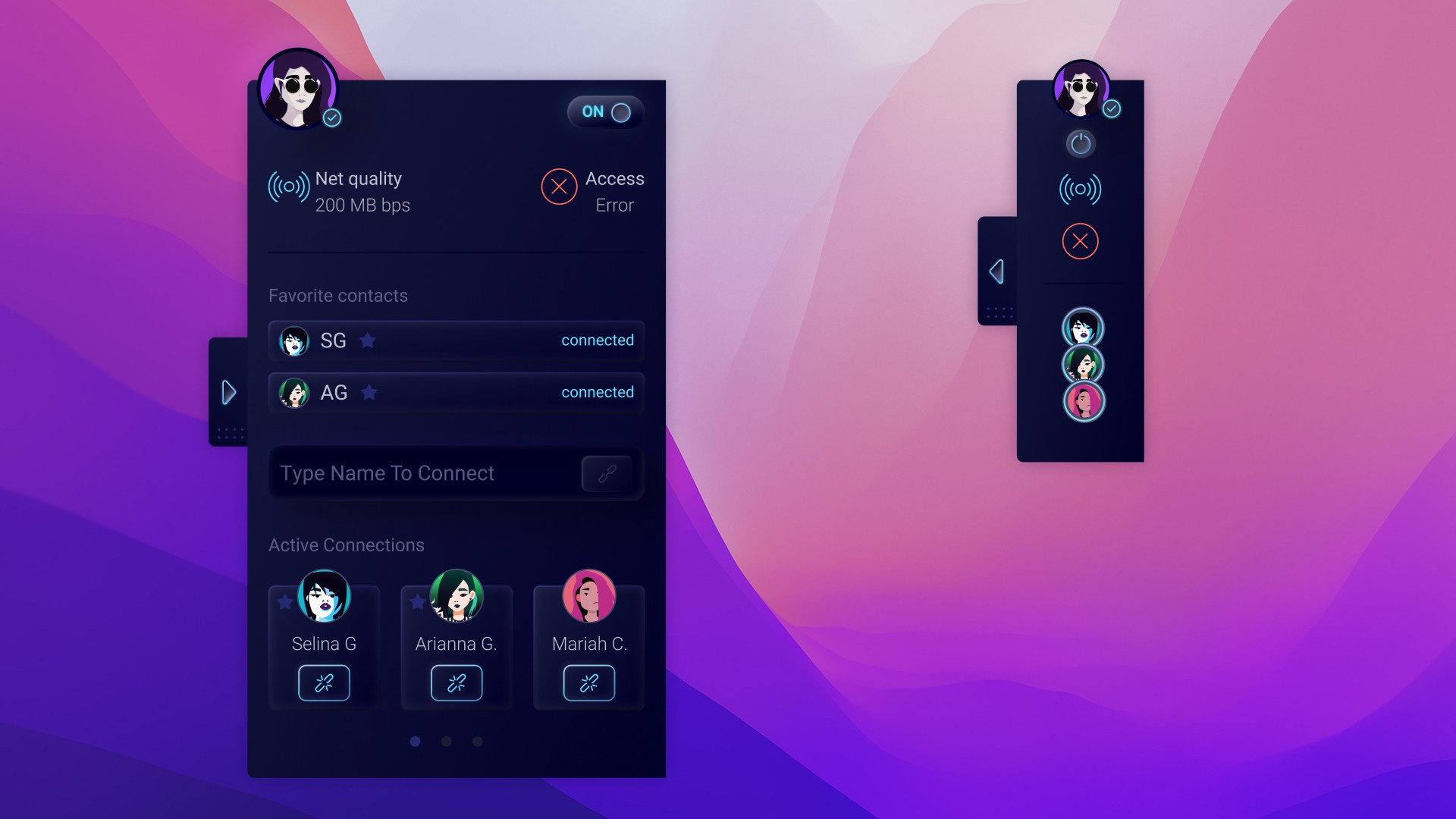
I created a high-depth UX wireframe where I show that the system is kept on the right as a hinting panel to what's inside but the actual use is when it is open.
I created a high-depth UX wireframe where I show that the system is kept on the right as a hinting panel to what's inside but the actual use is when it is open.
The interface :
small and sleek, side toolkit
my user connection quality and system access
add connections (computers)
recents/favorite connections
allow up to 3 connected devices
show the quality of the device connections
clear connect/disconnect button
The interface :
small and sleek, side toolkit
my user connection quality and system access
add connections (computers)
recents/favorite connections
allow up to 3 connected devices
show the quality of the device connections
clear connect/disconnect button


The Design
A trendy dark-mode design
combines Neo-morphism-inspired elements to create a look and feel that matches the work with it on the field. (cars dashboard, cool tech gadgets)
The Client wanted an elegant dark mode design
The system needs to be on call to use but not interrupt other uses for the computer.
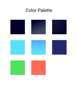
color palette based on Russian Black, which is a good dark mode base color for high contrast.
Informative icons to save up space and help complement the trendy neon colors.
Avatars generated with Dall-e from open AI, to add a little individuality to the users and add a little color to a dark monochromatic system.
adding fun animations to add little delight moments and stay on the car panel inspiration.
so one of the first UX decisions I took was to make it as a sidebar to the desktop, small and direct with instant information.
Now the UI it needs to complement the UX decisions and showcase with highlighted colors the active connections and their quality.
Letting the user work while this system is in the background but still informative so the connections turn into a cluster but still uses info by color stroke.
Easy to turn off even when closed, shows my availability on the user image.


