Herd management system
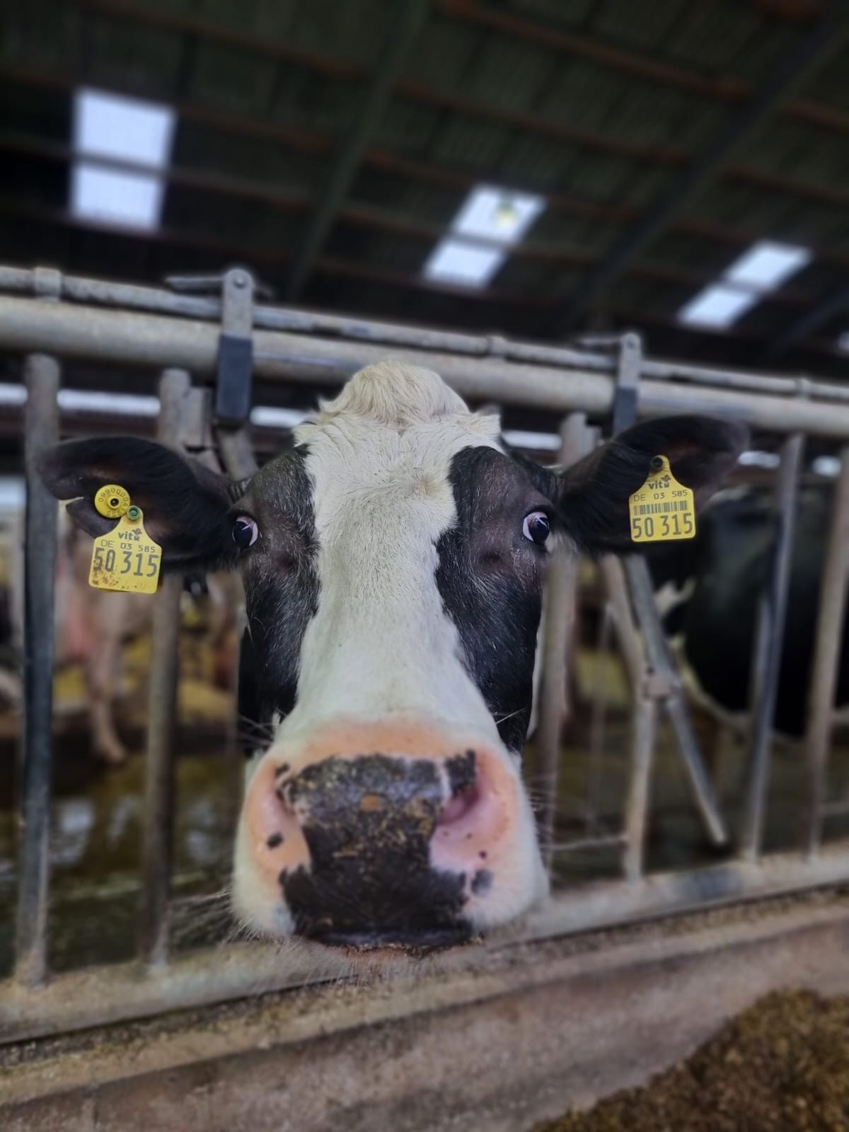
A concept design for a complex platform that helps farmers manage herd health, fertility, and milking tasks. The system integrates with Afimilk’s hardware to collect animal data and provide actionable insights, such as detecting animals in distress or fertility windows, essential for managing large farms efficiently.
Here is a small preview of before and after from the beta version :
Afimilk
Lead designer
Agri-tech
Challenge
The system’s cluttered interface made navigation and access to essential features frustrating for users. The onboarding process lacked clarity, leading to low new user adoption rates.
Additionally, the existing design system was not equipped to handle the increasing volume and complexity of data, creating usability and scalability challenges.
Results
The redesigned app features a clean, organized interface, making navigation seamless and key features easily accessible.
The updated onboarding process received positive feedback from Beta users globally, resulting in a noticeable increase in new user adoption rates and overall user satisfaction.
Process
We began by diving deep into user behavior through interviews, surveys, and analytics, uncovering key pain points and opportunities. This informed a complete overhaul of the app’s structure, streamlining navigation and prioritizing user needs.
We moved from low-fidelity wireframes to high-fidelity prototypes, constantly refining the design based on user feedback. Usability testing revealed areas for improvement, which we quickly addressed, ensuring a seamless and intuitive experience.
With a focus on clarity and consistency, we crafted a cohesive visual system—harmonizing typography, color, and iconography—while creating a style guide for future scalability. This iterative approach ensured the interface was not only clean and efficient but also aligned with both user expectations and business goals, delivering a truly refined product.
Persona
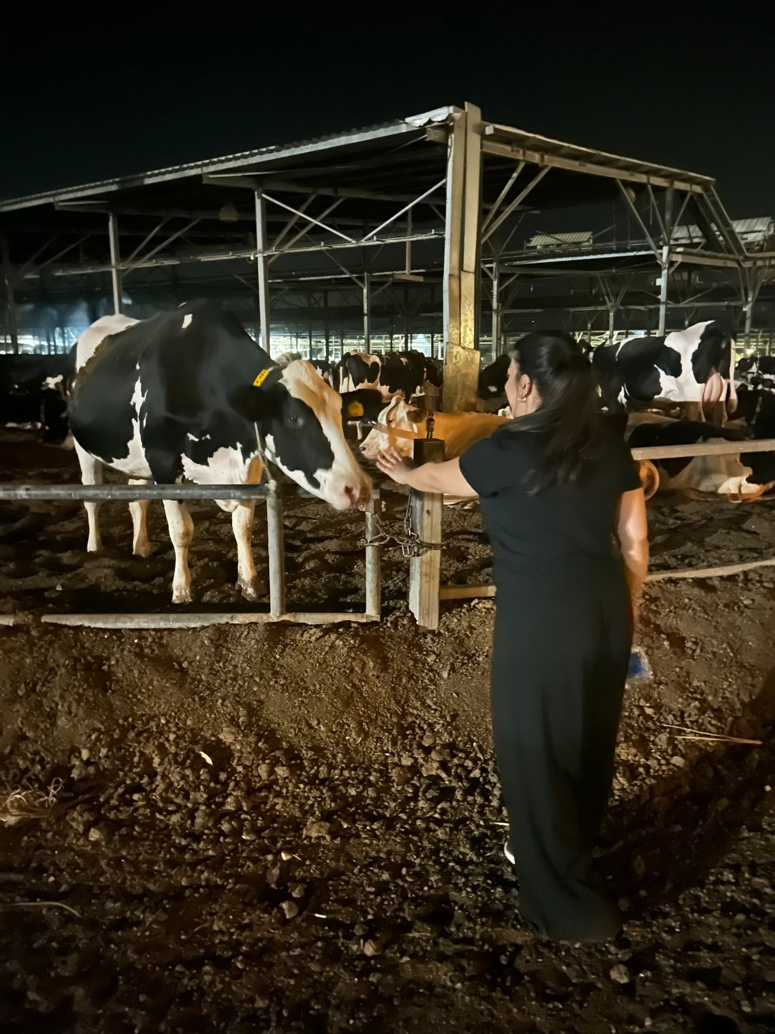
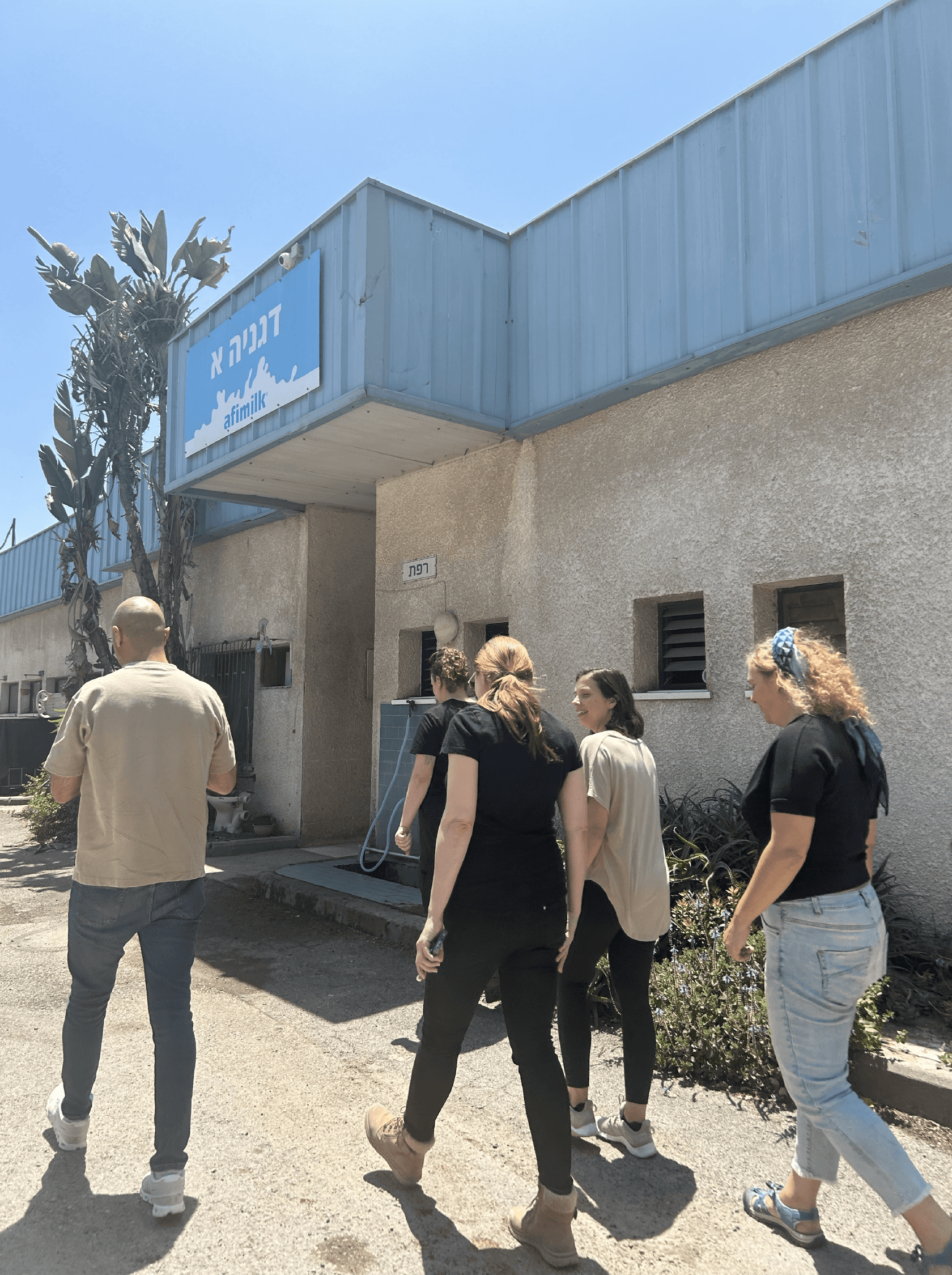
We did tests in person and from afar, with farmers from all over the world using Afimilk products and here is an example for two Personas I made after:


Israeli Farmer: Hands-on, Fast Decision-Making
• Farm Type: Medium-sized dairy farm, often family-run
• Pain Points:
• Needs quick data access while actively managing livestock
• Works in a fast-paced, hands-on environment
• Limited time for deep data analysis—wants actionable insights fast
• Design Takeaways:
✅ Prioritized a dashboard with quick, real-time insights
✅ Minimized clicks by reducing navigation steps
✅ Used color-coded alerts for fast decision-making
Key Changes
Header: The original header was cluttered, with an oversized white space and a commercial banner that testing revealed to be ineffective and unnecessary.
In the redesigned version, the banner was removed, and actions were simplified into clean, elegant icons, maximizing space and improving usability. This change created a more focused and efficient interface for users.
Table: The original table was small and cluttered, making it difficult to display and understand information.
By removing unnecessary gradients and graphic boxes, we freed up space to create a larger, clean, and data-oriented table.
The redesigned table features ample white space, making the data easier to digest and significantly improving readability and usability.
Calendar: The original design featured a large, cluttered monthly calendar that testing and field research revealed did not match farmers’ needs. Farmers primarily required a clear, focused view of tasks for the upcoming week. The new design replaced the monthly view with a streamlined weekly calendar, improving usability and aligning with real-world workflows.
Color Simplification: The old design relied heavily on color-coded tasks, which testing showed to be confusing and unnecessary.
In the redesign, we removed the redundant task colors and introduced bright, informative highlights for critical information.
This change made the system more accessible, reducing visual noise and improving clarity for users.
Conclusion
The Afimilk Herd Management system redesign successfully addressed the usability issues, resulting in a more intuitive and user-friendly experience. The improved UX/UI design led to increased user adoption, engagement, and satisfaction, demonstrating the value of a well-designed template for UX designers.
By simplifying the design we were able to keep the data in the right hierarchy and make it easier to understand by adding high-contrast colors, a white clean background, and dark Typography.


